Next
Miel de Aiguá
Organic honey from Finca La Viviana, Aiguá, Uruguay.
View ↗


Case study · Brand identity
Like this project?
Start a projectAn environmental strategy consultancy, framed by a single ring.

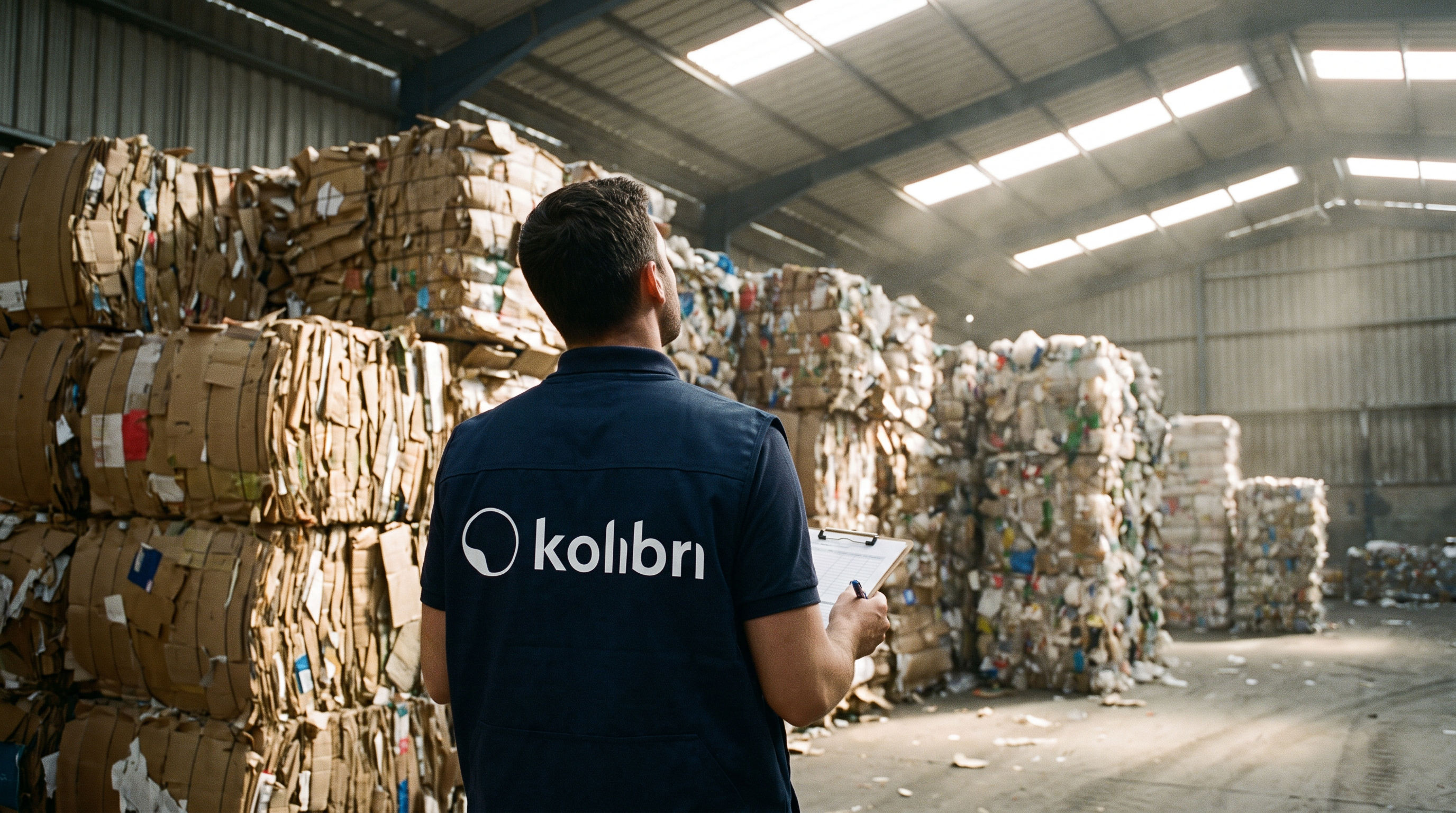
Kolibri helps companies across Latin America build sustainability into how they do business: carbon, circularity, water and biodiversity. The brand had to work in board decks, impact reports and field projects alike.
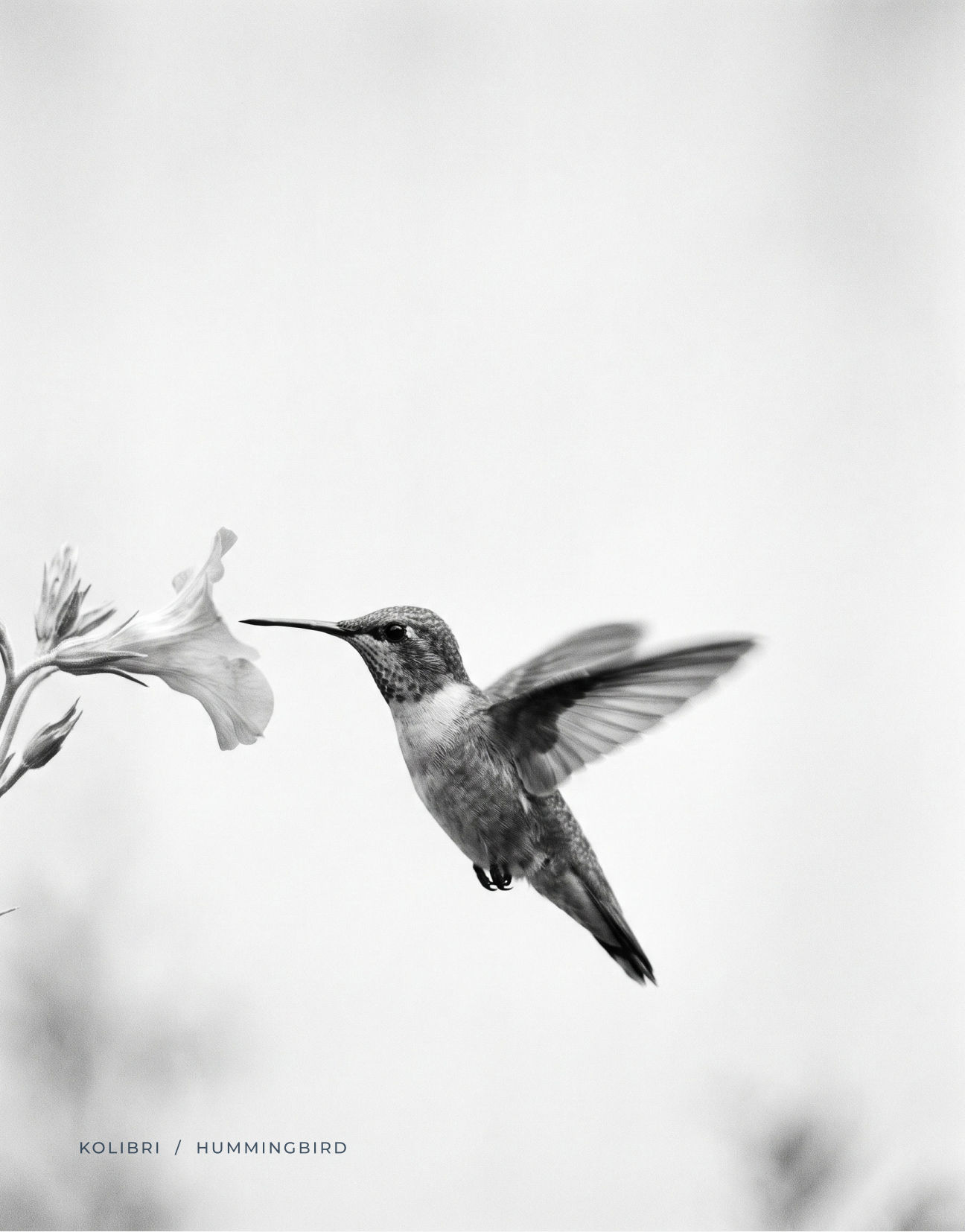
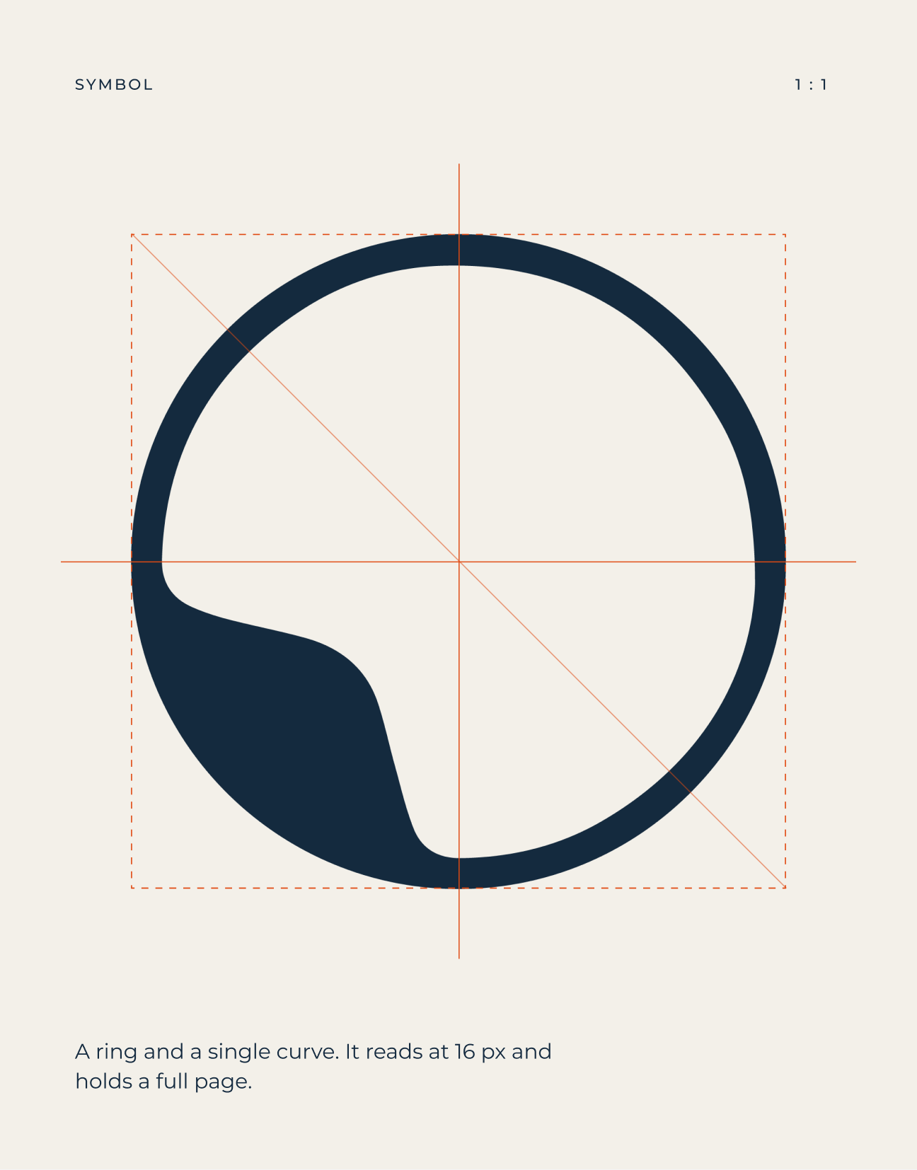
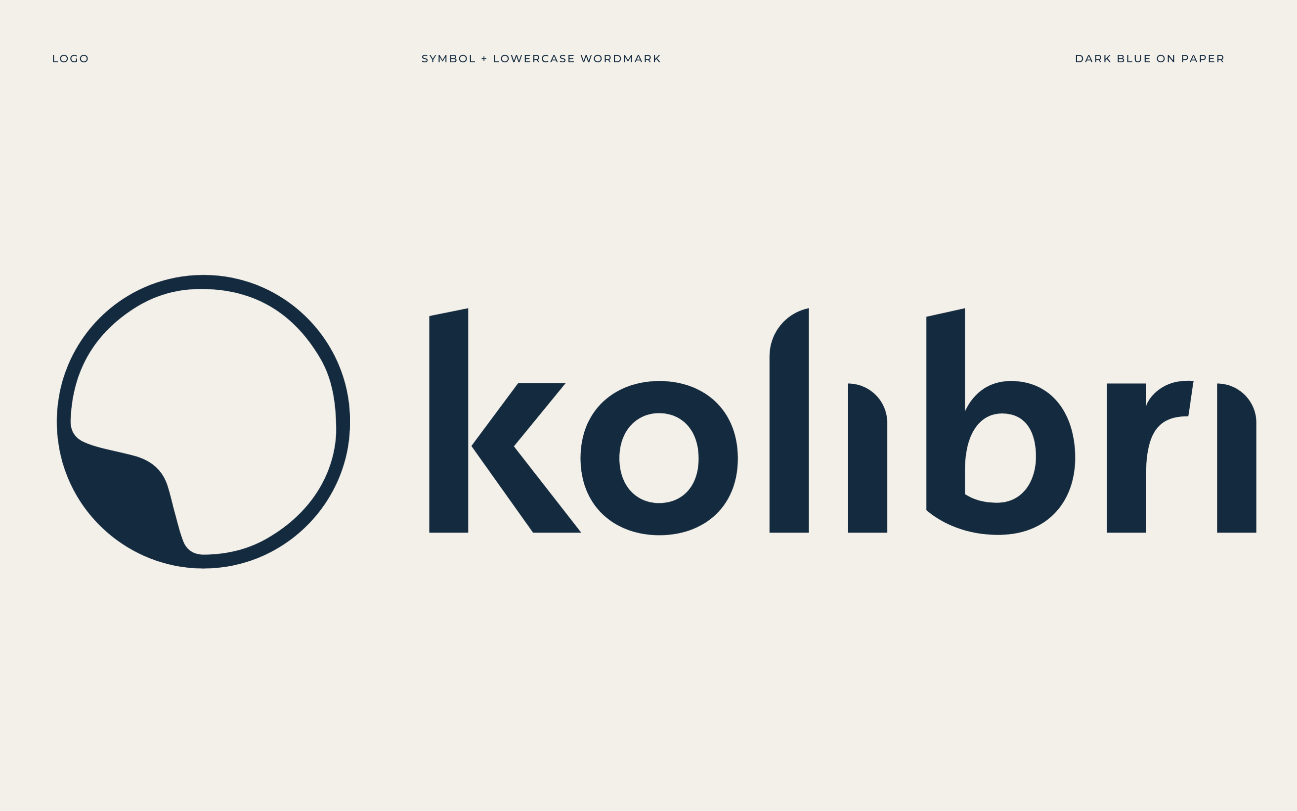
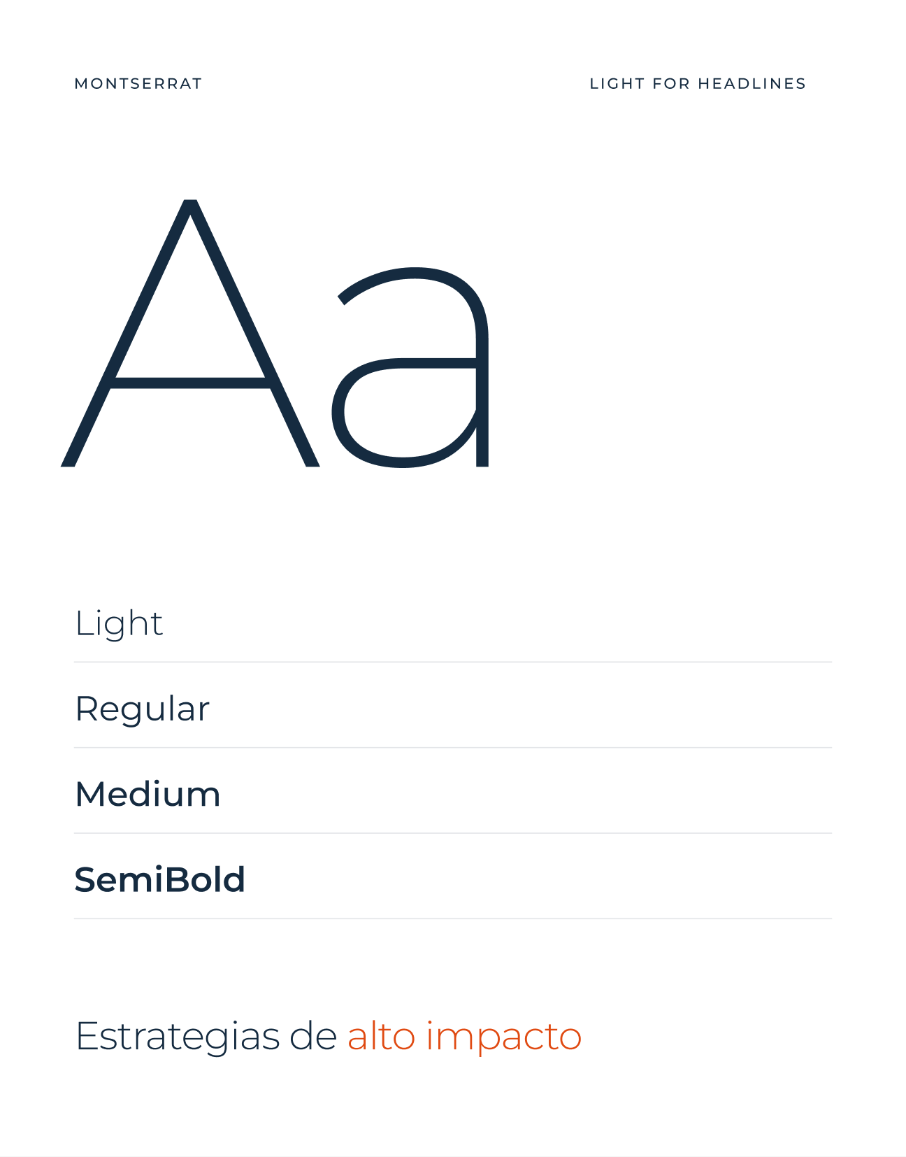
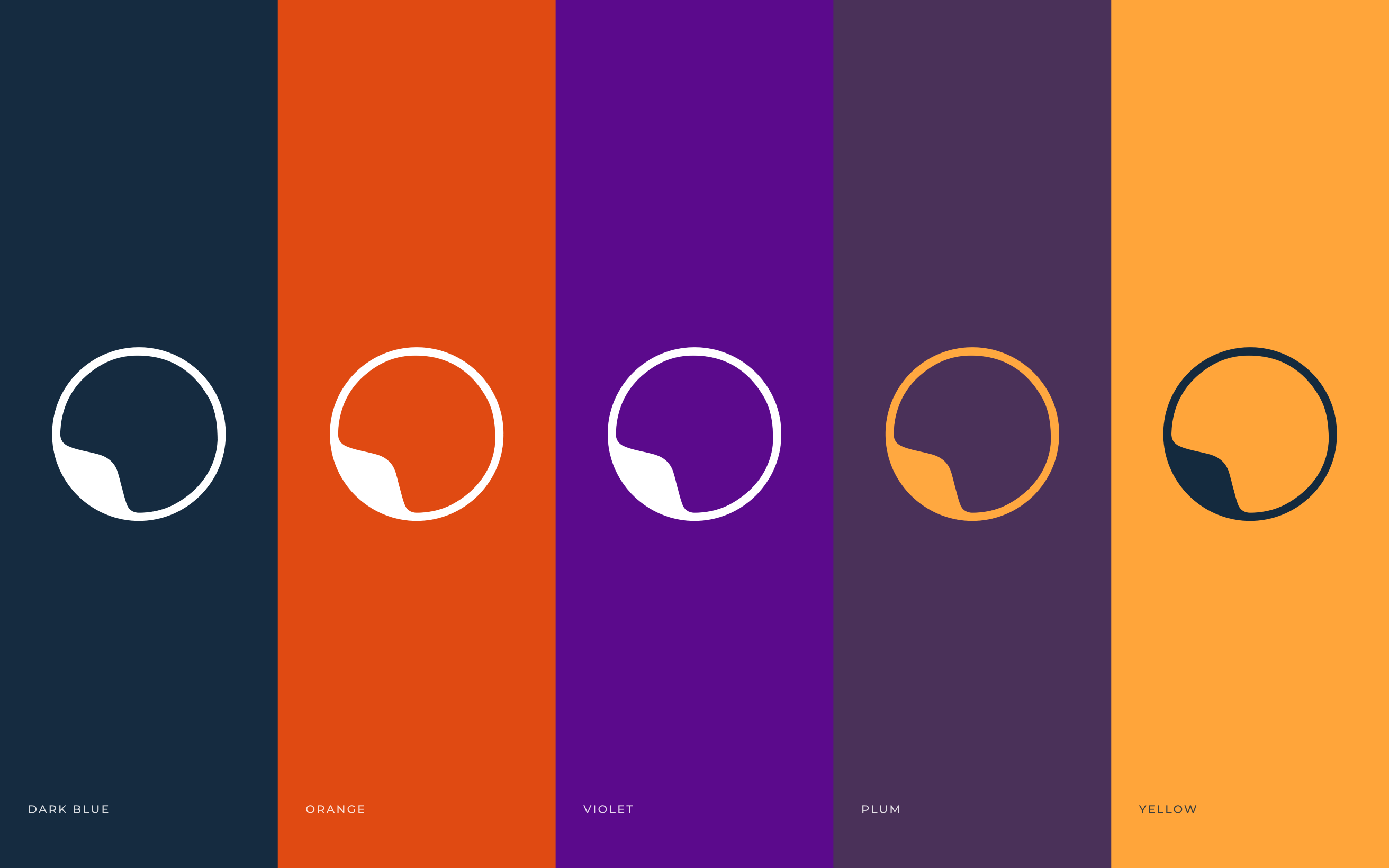
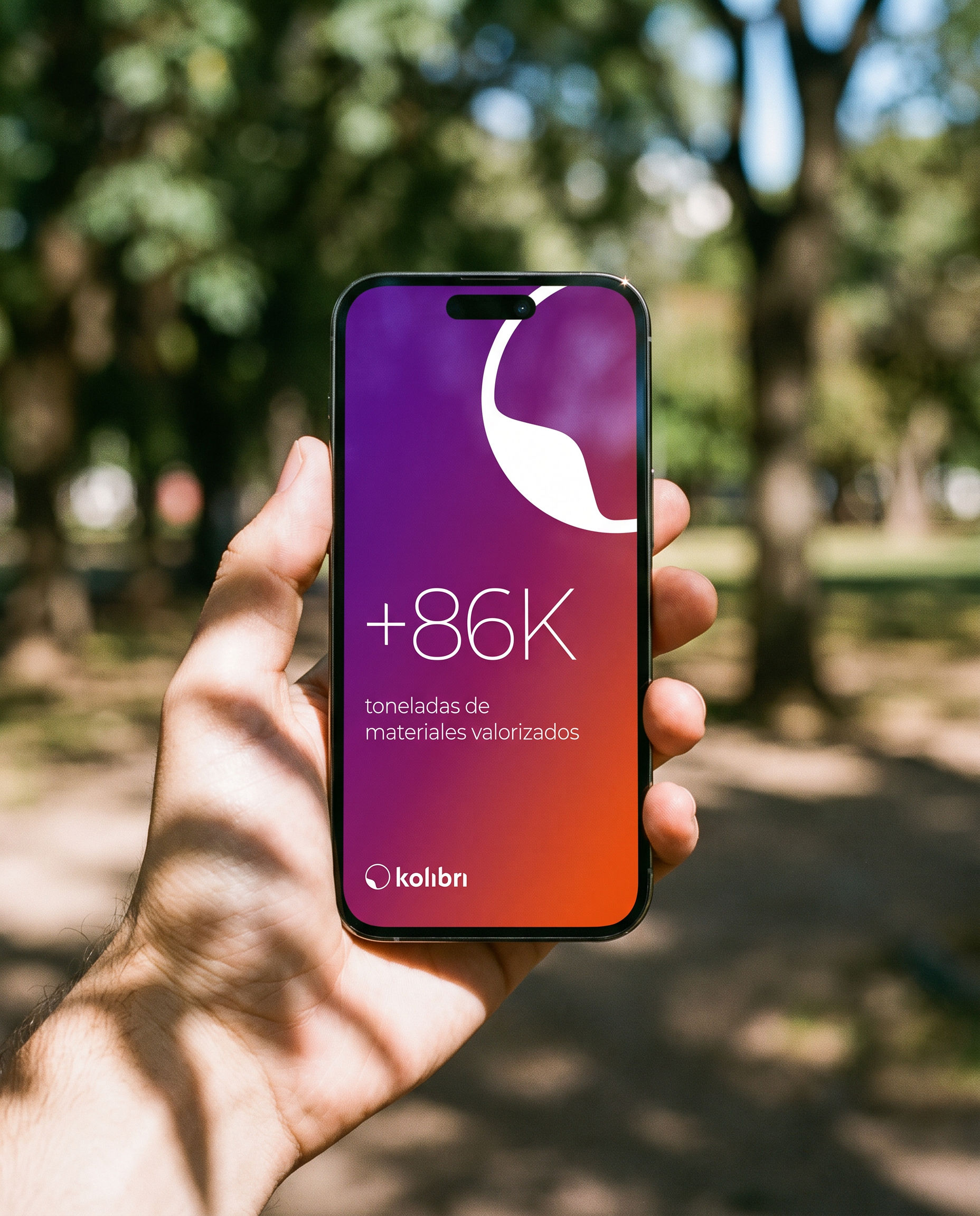
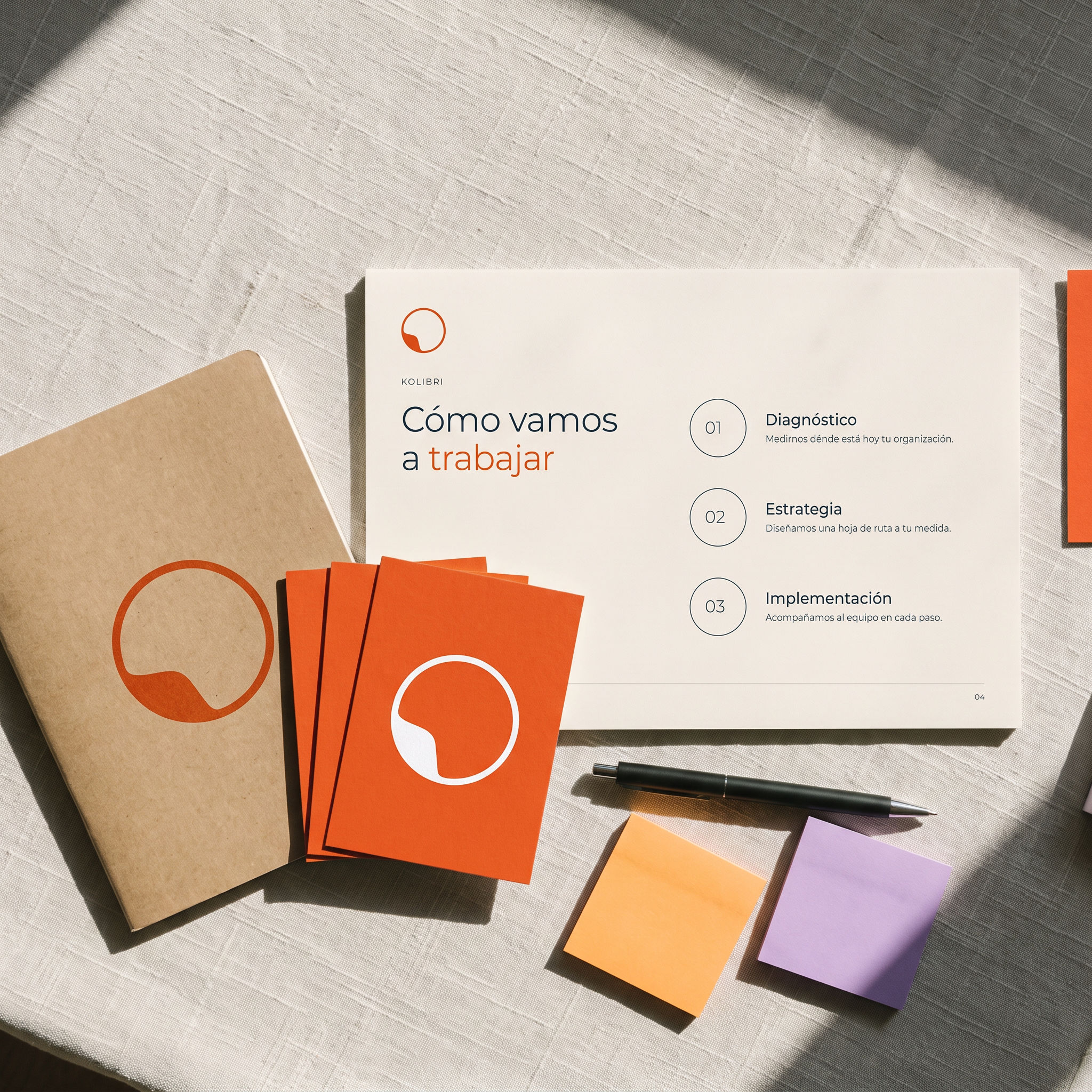
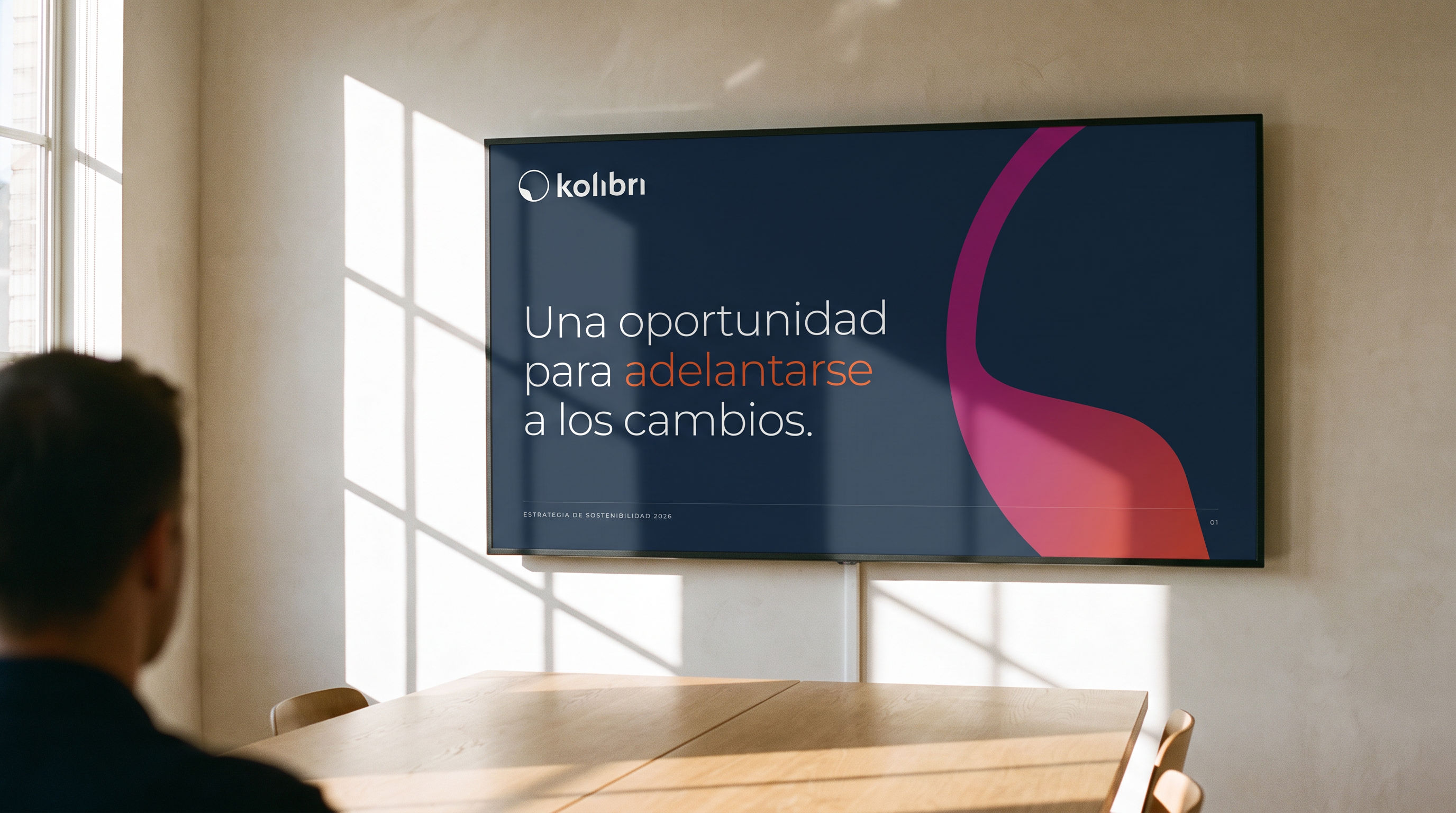
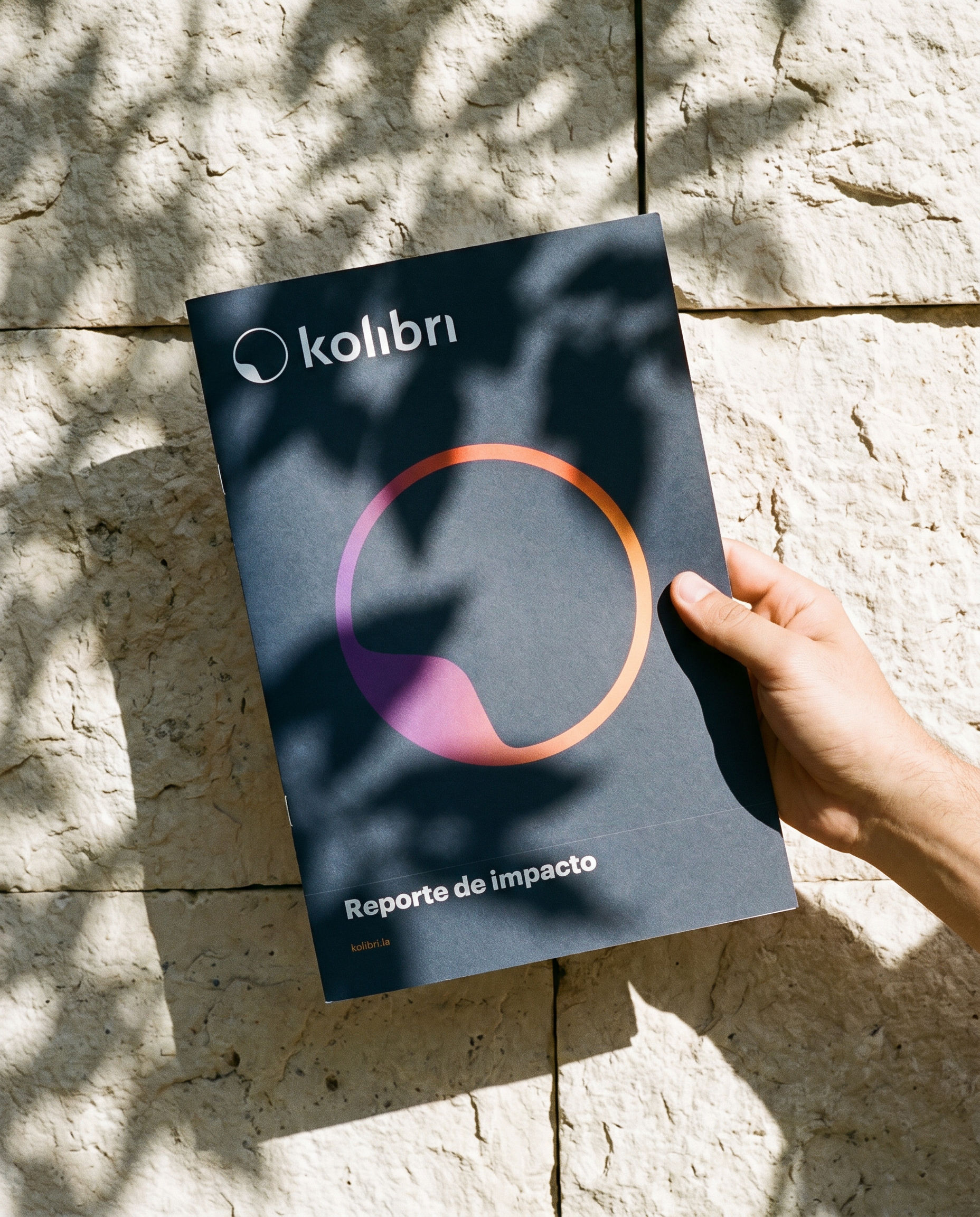
Kolibri means hummingbird. The ring is a hummingbird seen from above, and a sign of circularity. One thin ring and a single curve read at 16 px and hold a full page. A violet-to-orange gradient, a warm palette and Montserrat Light carry the voice.




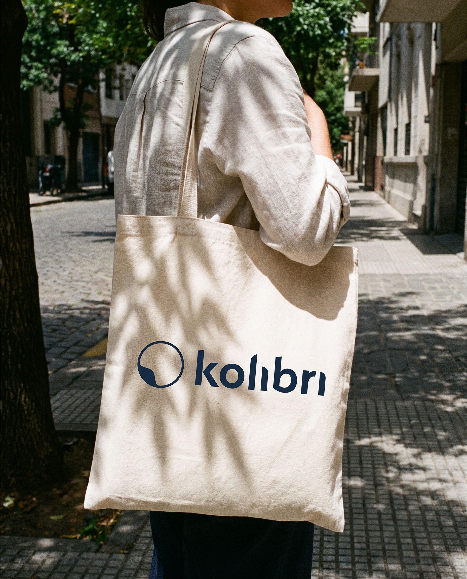
From impact reports and workshop kits to summit booths, campaign posters and social posts.







Organic honey from Finca La Viviana, Aiguá, Uruguay.
View ↗